Introducing The Art of Asking
Since October 2011 my flatmate and I where quite busy realizing a little pet project of ours called The Art of Asking. The ultimate goal is to visualize the world’s opinion in an intuitive fashion and make it easy for everyone to play around with the data.
The idea behind The Art of Asking is that users submit interesting questions which are answered by users around the world. But instead of showing only the boring result, we want to provide interesting insights and statistics about the answers given.
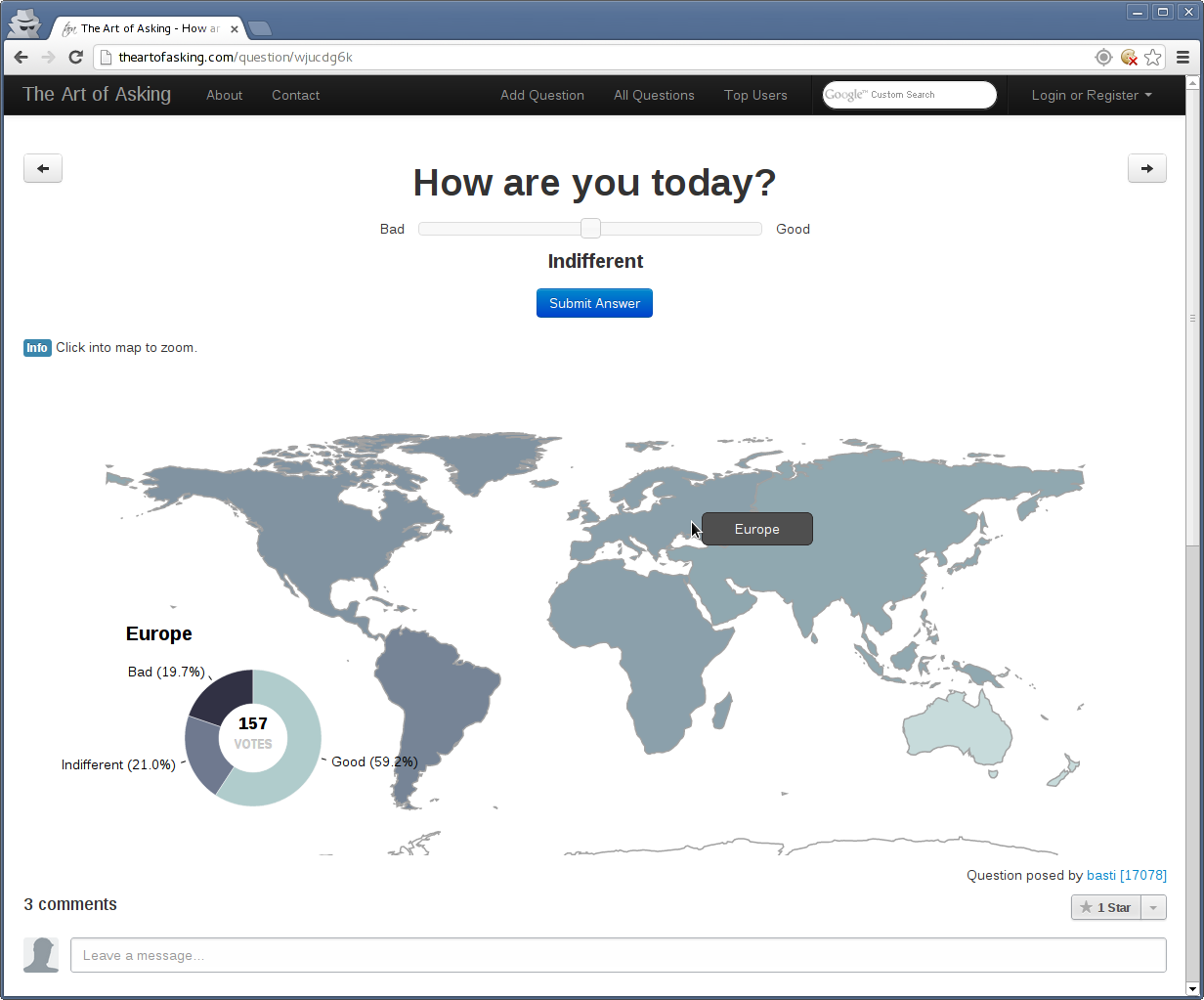
For now the users can see the results of the question visualized by geographical regions. For example on the page for the question ‘How are you today?’ you can see the interactive map with the pie chart. The map shows the average/dominating answer for each continent encoded by color, and the pie chart the distribution of the different answers for that region. If you move the mouse over a continent the pie chart updates and shows the distribution of answers for that continent. You can also click to zoom into the map to see the same for countries and regions. This allows you to investigate how the answers are distributed around the world.

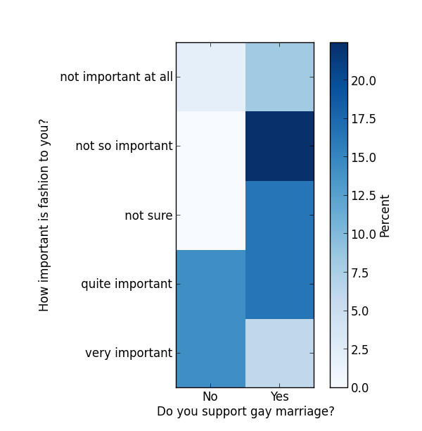
This is already quite nice and fancy to play around with, but of course we want much more. Right now we’re working on a feature which will users allow to combine two arbitrary questions and see how the answers are related. This doesn’t sound like much, but it is very addictive to crawl through the list of questions and find interesting correlations. Here is a little plot how it could look like (the data is from the actual data base of answers).

For each possible combination of answers it shows the percentage of people who answered in that combination. Of course those plots only make sense when enough users answered for both questions you want to compare which is right now not very often the case, so I guess we’ll roll out that feature sometime later when we have more data. But we have lots of ideas and are working on further ways to investigate the answers. Obviously one low hanging fruit for example would be the distribution of the answers over time.
We’ve been working for over a year now on this project in our spare time and we built it more or less from scratch. I wrote a small WSGI framework in Python and on top of that the WSGI application which runs the site. We use MongoDB for the storage of the data, uWSGI and nginx for the server, Jinja2 and Bootstrap for the HTML and D3.js for the visualization of the data, where Maci did a wonderful job realizing the interactive map and charts.
We’re running this site since July 2012 now and are already quite satisfied with the number of users, and the quality of the questions. But of course we could always use more (especially more answers). So if you want to try it out, go to theartofasking.com and fill out the blank spots on the map! We’re happy about every answer and question we can get and are eager to hear your suggestions.